

We’d love to hear from you — whether you have a project in mind, or just want to say hi.
letschat@ntdesign.studio
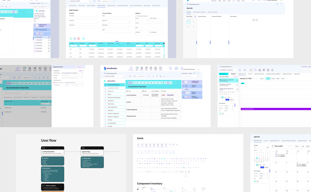
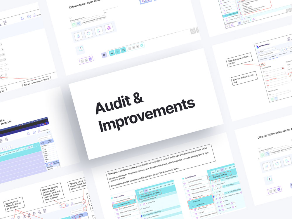
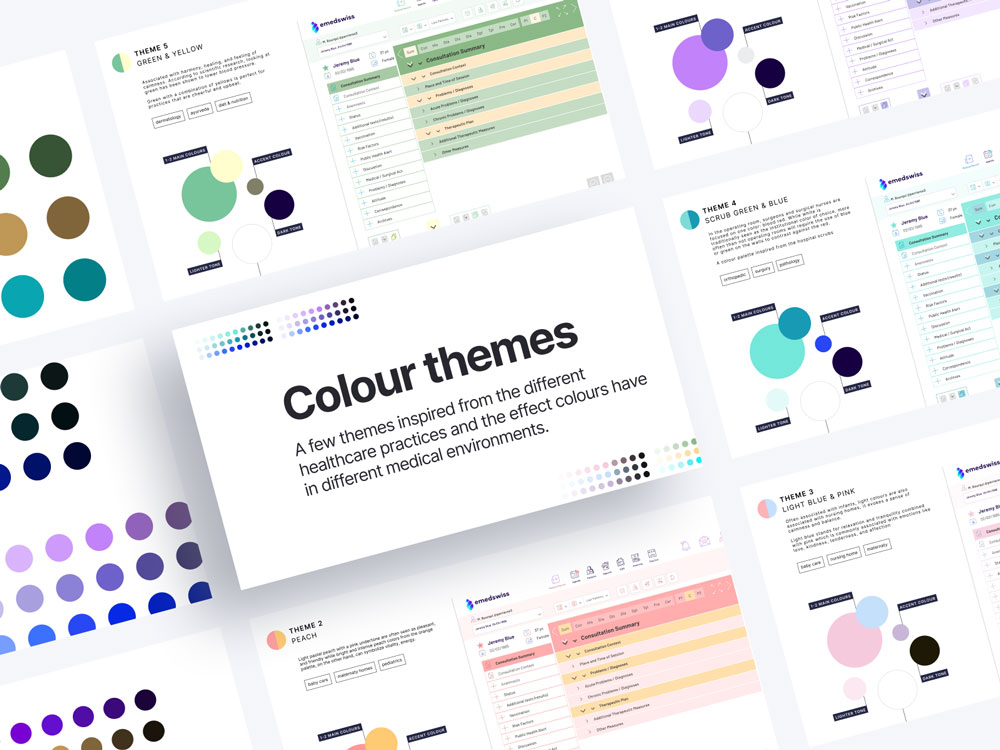
We began by auditing the current interface to identify structural and visual gaps, followed by a systematic refinement of the design language. A more controlled and accessible colour palette was introduced, supported by clearer typography and a stronger hierarchy across screens. Components and interaction patterns were standardised to ensure consistency and predictability. In parallel, new features were designed to align seamlessly with existing workflows, with a focus on reducing friction and supporting efficient task completion. The result, a more cohesive and dependable interface that enables faster navigation, reduces ambiguity, and better supports the demands of clinical environments.